
Introduction
User Interface (UI) is the interactive platform through which users engage with a digital product, encompassing everything from screens and pages to buttons and icons. It serves as a bridge between users and the functionality of the software or application. We should not confuse between visual design and UI, While UI visual design focuses on the layout and interactive elements in digital screens, Visual Design is a broader discipline that includes UI but extends to the overall aesthetics, color schemes, branding and all formats. In essence, together, they shape the look, feel, and functionality of digital interfaces. Designing is not arranging elements as we want but should keep users in mind, several elements enhancing User experience. Here we identified 10 things to consider while designing User Interfaces.
Table of Contents
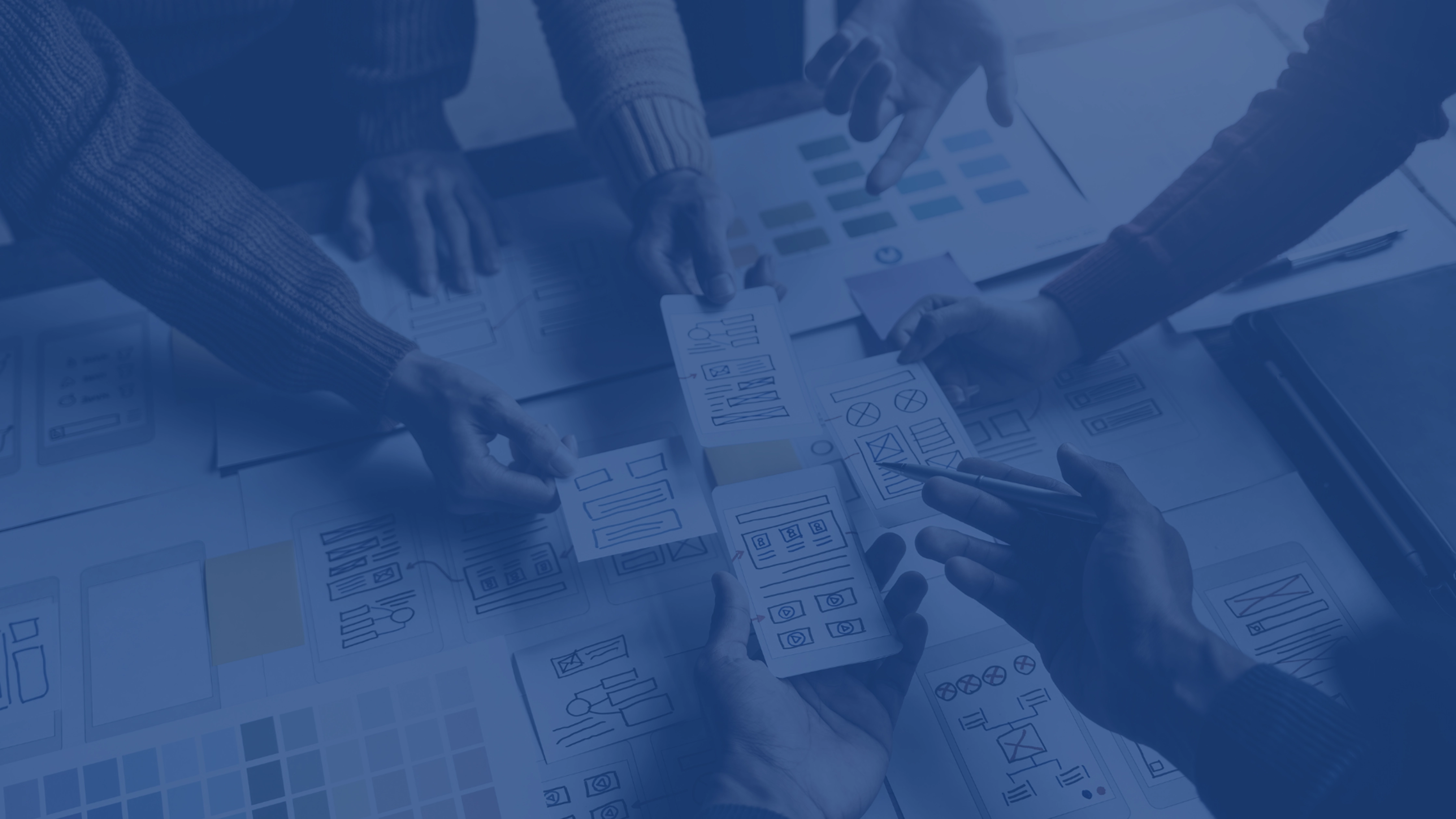
Wireframing and prototyping
Wireframing and prototyping are integral steps in UI visual design. Wireframing involves creating low-fidelity, skeletal representations of a user interface to outline the basic structure and functionality. It serves as a blueprint for design, focusing on layout and user flow. Prototyping, on the other hand, involves building interactive, high-fidelity models that simulate the final product’s look and feel. It allows designers to test functionality and gather user feedback before development. Low-fidelity wireframes help conceptualize ideas and streamline the design process, while high-fidelity prototypes provide a realistic user experience, aiding in fine-tuning details and ensuring a seamless, user-friendly final interface. Both are crucial for efficient and effective UI visual design.
We cannot directly jump in to wireframing we done UX design thinking process, Here is our blog explaining the process.
Designing for optimal UX isn’t just about flawless code—it’s about impactful projects. Follow the top 5 UX Design Thinking steps and harness the Kano Model’s emphasis on UX. Let’s create designs that elevate your customers’ experiences!https://t.co/H0P4veOcpG
#UXDesign pic.twitter.com/oGPQOjGqwx
— Sparity (@sparity) December 4, 2023
Typography
Typography in UI visual design is the art and technique of arranging type to make written language legible, readable, and visually appealing. It plays a crucial role in user experience by guiding attention, conveying hierarchy, and establishing a brand identity. Well-chosen fonts, sizes, and spacing enhance readability and user comprehension. For example, in a mobile app, using a clear sans-serif font for body text ensures readability on small screens, while a distinctive serif font in a website header can reinforce brand personality. Consistent typography fosters a cohesive and professional visual language, contributing to a positive and effective user interface.
Iconography
Iconography in UI visual design involves the use of symbols or icons to convey information quickly and intuitively. Icons serve as visual cues, enhancing user experience by simplifying complex actions and aiding navigation. They contribute to a cohesive and user-friendly interface, improving overall usability. For instance, a magnifying glass icon commonly represents search, a trash bin signifies delete, and a heart symbolizes favouriting or liking. Consistent and well-designed iconography fosters clarity, reduces cognitive load, and enhances the overall aesthetics of the user interface, making it more accessible and engaging for users.
Colour Consistency
Color in UI visual design is a potent tool, rooted in psychology, influencing user emotions and perceptions. Warm tones like red elicit excitement, while cool blues instill calmness. The careful selection of a palette establishes visual hierarchy, aiding user navigation and interaction. Contrast enhances readability and focus, fostering a seamless user experience. Color psychology guides designers to evoke desired emotions, such as trust or urgency. Sometimes mix of colors cause distraction and sometimes it’s a unique thing. Consistency in color schemes fosters brand identity and recognition. In essence, color transcends aesthetics, playing a pivotal role in shaping the user’s perception and interaction with digital platforms.
Choosing RGB (Red, Green, Blue) for digital screens is pivotal due to its additive color model, aligning with how screens emit light. This model allows for a wide spectrum of colors by combining varying intensities of these primary colors. RGB mirrors the way the human eye perceives light, enabling digital devices to produce a vast array of hues.

Brand Consistency
Brand consistency in UI visual design ensures a unified and recognizable brand identity across digital interfaces. Through cohesive color schemes, typography, and imagery, it fosters a seamless user experience, reinforcing brand values and enhancing overall brand recognition. Google maintains a consistent design language called Material Design across its various platforms and products. The use of vibrant colors, flat design principles, and consistent iconography creates a cohesive visual identity. Whether users are interacting with Google Search, Gmail, or Google Drive, they encounter a uniform design language. This consistency not only reinforces the Google brand but also provides users with a familiar and intuitive experience, regardless of the specific product or platform they are using.
Layout
In UI visual design, a layout is the arrangement of elements, guiding users through content. Its responsibility lies in creating a structured and intuitive user experience. The layout organizes components such as text, images, and interactive elements to enhance readability and usability. It establishes visual hierarchy, emphasizing key information and facilitating seamless navigation. Effective layouts consider user flow, responsiveness, and accessibility, ensuring a cohesive and engaging design. By balancing aesthetics and functionality, the layout plays a pivotal role in conveying information and fostering a positive user interaction with the interface.
Content
In UI visual design, content is paramount. It goes beyond aesthetics; it’s about conveying information effectively. Crafting content demands clear, universally understandable grammar, maintaining professionalism. A well-designed UI loses impact with spelling errors or subpar content. Users engage with both visuals and the message, emphasizing the need for cohesive, error-free content. It’s not just about what’s displayed; it’s about what’s communicated. Prioritizing content ensures a seamless user experience, enhancing comprehension and usability. In essence, the success of UI visual design hinges on the fusion of compelling visuals and impeccable, meaningful content.
Elements
In UI visual design, elements like card systems enhance content hierarchy, facilitating organized information display. Tab bars offer intuitive navigation, streamlining user interactions. Payment method visuals establish trust, ensuring a seamless transaction experience. Thoughtful placement of input fields optimizes user engagement, while buttons serve as actionable cues, promoting interaction. These elements collectively contribute to a cohesive and user-friendly interface, guiding users through a seamless journey. A harmonious blend of these components not only enhances aesthetics but also influences user behaviour, creating an aesthetically pleasing and functionally efficient design that promotes positive user experiences.
Composition
In UI visual design, Composition in design involves arranging components to create a pleasing experience for the user. It contributes to striking a balance between the presentation and arrangement. Unity, rhythm, movement, contrast, pattern, and proportion are the components of composition. While balance fosters serenity, unity makes sure that everything feels harmonic and unified. Leading lines, figure placement, and object arrangement can all be used to create movement. Pace is influenced by rhythm for the viewer. While pattern entails the regular repetition of lines, forms, colors, or values, high contrast produces a distinct sensation. The size and scale of the objects in the composition are referred to as proportion.
Tools and Techniques
Proficiency in design tools is paramount for effective UI visual design. No matter how brilliant the conceptualization, the ability to adeptly navigate software translates ideas into tangible digital interfaces. Mastery of tools like Adobe XD, Sketch, Figma, InVision Studio, Axure RP, Zeplin, Balsamiq, and Adobe Photoshop is essential. Each tool serves a specific purpose, from prototyping and wireframing to collaborative design in real-time. Without this mastery, the seamless execution of design concepts becomes challenging. In the realm of UI visual design, software proficiency is the linchpin that transforms creative visions into user-friendly, visually compelling digital experiences.
F-Pattern: Users naturally scan content in an ‘F’ shape—top-left, horizontal, then vertical. Z-Pattern: Users scan in a ‘Z’—top-left, diagonal, then horizontal. Sometimes designers tend to use the rule of thirds, a photography technique for visual harmony.
Whitespace in UI visual design is crucial for clarity, and user focus. It enhances visual hierarchy, separates elements, and promotes a balanced, organized layout, improving overall user experience. Whitespace is a specific type of negative space deliberately left blank in a design. Negative space includes all the unoccupied areas, whether intentional or not, while whitespace specifically refers to intentionally empty areas for design and layout purposes. Both terms should not be confused.
Conclusion
We have shared 10 key considerations in UI visual design, emphasizing the importance of maintaining consistency in designs and efficiency in using tools while prioritizing the content. Regardless of how well you code, the design is the initial point of interaction with users. Sparity’s expert UX/UI team ensures that your user interfaces instill trust and evoke emotions through well-thought-out, user-centric, and responsive designs that actively engage users. Partner with us for all your UI visual design needs.


