Introduction
Data is everywhere. There is no substitute for data in this day and age. It enables businesses to conduct analyses, make informed decisions, recognize trends, and set realistic goals. However, having access to all the data necessary for success is not enough, if one doesn’t know how to interpret or use it.
With access to more and more data at our fingertips, it’s getting harder to focus on the information that’s relevant to our problems and present it in a way we can use. The world of datasets can seem foreign to many people outside of analytics. Understanding the data is crucial if you want to come up with any valuable conclusions. This is where data visualization comes in. And data visualization tools help businesses present data in a visual form that is easier to comprehend and to obtain insights more quickly.
One of the most well-known early instances of data visualization was a flow map made in 1869 by French civil engineer Charles Joseph Minard to assist in understanding what Napoleon’s men endured during the disastrous 1812 Russian campaign. Two-dimensional coordinates were utilized to show information like troop strength, distance traveled, temperature, latitude and longitude, and heading on the map.
With the big data analytics market expected to reach $103 billion by 2027, it’s critical to begin leveraging the power of cloud data and advanced analytics. The popularity of data visualization tools can be attributed to their ability to provide analysts and statisticians with an interface, database connectivity, and machine learning technology in a single, streamlined package to create visual data models easily.
In this blog, we shall look at what data visualization is and what are some of the best data visualization tools available in the market.
Table of Contents
What is data visualization?
The term “data visualization” refers to the practice of producing a visual depiction of the critical insights, patterns, and trends within a dataset through the use of graphics such as charts, graphs, maps, plots, infographics, and even animations. Data visualization is a subfield of data presentation architecture (DPA), which identifies, locates, manipulates, formats, and visually represents complex data correlations and data-driven insights in a simple and digestible style.
Data visualization is a powerful tool for transforming large amounts of raw data into digestible, visually appealing, actionable insights for your organization. Today’s data visualization solutions leverage external data sources to do more than just improve your visibility into KPIs; they also unify data and apply AI-driven analytics to highlight connections between your KPIs and the market and the wider world.
Why is data visualization important?
Humans are visual beings, and there is no denying that. And that’s what data visualization taps into. Data visualization employs human perception, cognition, and the ability to detect size, shape, position, quantity, and color changes to improve the understanding of a large dataset. Regardless of their degree of knowledge, the appropriate visualization can get everyone on the same page, whether the information is basic or complex.
A pioneer in data visualization, Edward R. Tufte, in his book The Visual Display of Quantitative Information, says, “Graphical excellence is that which gives to the viewer the greatest number of ideas in the shortest time with the least ink in the smallest space.“
Data visualization is crucial because it simplifies the process of recognizing hidden trends in large amounts of data and enables decision-makers to interrelate the data to gain better insights which are typically time-consuming for enterprises. The graphical depiction of data sets allows analysts to visualize new concepts and patterns. With the daily increase in data volume, it is hard to make sense of the quintillion bytes of data without data proliferation, which includes data visualization.
Gerry D’Angelo, VP Global Media at Procter & Gamble, emphasizes the value of data visualization in his tweet by saying “I have this chart above my desk as constant reminder of how to convey the most with the least”
I have this chart above my desk as constant reminder of how to convey the most with the least #edwardtufte pic.twitter.com/vqzsNaX9w4
— Gerry D’Angelo (@GerryDAngelo) September 21, 2022
What is a data visualization tool?
A data visualization tool is a cloud-based software application that facilitates the representation of structured and unstructured data in easily digestible graphical formats. Data visualization tools simplify the identification and interpretation of patterns, anomalies, and trends in large amounts of data through the use of visual representations such as charts, graphs, and maps. And it’s an excellent tool for business owners and staff to use when presenting information to people who aren’t tech-savvy.
Each tool has its own set of unique features, but at their most fundamental level, they all let you input a dataset and present data visually. Most, though not all, have pre-built templates that you may use to make visualizations. Big data visualization tools, such as the ones described below, can handle data sets with millions of data points. These tools can significantly facilitate visualization by automating a number of formerly laborious tasks for the designer or data handlers.
Organizations should select the most suitable data visualization solution that best meets their business needs. At the very least, the tool must provide interactive visual creation, adaptable connections to data sources, data merging, automatic data refresh, sharing of visuals with others, secured access to data sources, and widget exporting. These features allow you to create the most effective data visualizations and save time for your organization.[/vc_column_text][vc_custom_heading text_size=”h3″ text_space=”fontspace-111509″ uncode_shortcode_id=”104926″]Top Data Visualization Tools for 2022
Today, there are a number of data visualization tools out there in the market. To assist you in narrowing down your options, we have produced a list of our Top 10 Data Visualization Tools.
1. Microsoft Power BI
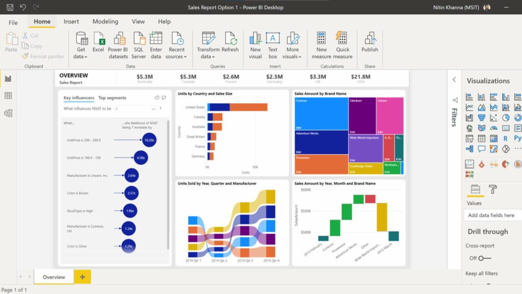
Power BI, provided by software powerhouse Microsoft, is among the most widely used data visualization solutions. Using Power BI, businesses can create visualizations either in the cloud or on their own dedicated reporting server, as it is downloaded software. Create reports and dashboards in a matter of minutes with this dynamic tool that syncs with sources like Facebook, Oracle, and more. In addition to offering features like end-to-end data encryption and real-time access monitoring, it also has artificial intelligence (AI) capabilities, excel integration, and data connectors built right in.
Power BI offers self-service analytics tools that may be used to analyze, aggregate, and share data. It serves as a centralized repository for all your business data, which is accessible to all your business users. Power BI is one of the most comprehensive data visualization solutions that supports a wide variety of backend databases, such as Teradata, Salesforce, PostgreSQL, Oracle, Google Analytics, Github, Adobe Analytics, Azure, SQL Server, Excel and more.
2. Tableau

Tableau’s data visualization features have earned it widespread acclaim, but the program does far more than generate eye-catching graphs and charts. The live visual analytics they provide are accessible via a drag-and-drop interface, making it easy to discover patterns in data. The visualization tool supports a variety of data import sources, including Microsoft Excel, Box, CSV files, Google Ads, Salesforce data, PDF files, and Google Analytics. As an added bonus, it is compatible with a wide variety of databases such as Teradata, SAP, My SQL, Amazon AWS, Hadoop and more.
Tableau offers extensive options for securing data without scripting. Tableau effectively generates visuals and graphics from massive, constantly-evolving datasets employed by artificial intelligence, machine learning, and big data applications. Tableau provides a number of products, including a desktop version of its analytics platform, a server version, a web-hosted version, and a CRM package. In addition, it offers a free version called Tableau Public. It’s worth noting that the public can view any visualizations you make using the free version. As a result, while it’s an excellent choice for getting acquainted with the software, it shouldn’t be used for anything too secret or valuable.
3. QlikView

QlikView is more than just a data visualization tool; it’s also a data discovery platform that empowers users to create customized visualizations, make informed decisions by accelerating analytics, reveal new business insights, and perform enterprise reporting. Built around a “drag and drop” visualization interface, it eliminates the need for users to write custom code in order to import data from various sources like databases and spreadsheets. These features also make it a relatively easy-to-learn and understand tool.
QlikView makes it simple to aggregate, load, view, and investigate data of any scale. All the graphs, tables, and other data representations are dynamic and adapt in real-time to new information. Using simple drag-and-drop operations, the QlikView AI can help you gain insights from your data and produce insightful analytics. The core and patent-protected technology of QlikView includes in-memory data processing, which provides users with lightning-fast results. It computes aggregates on the fly and reduces the size of data to 10% of its original size.
4. Sisense

Sisense is an intuitive data visualization tool that focuses on simplification and streamlining. This tool allows you to import data from Google Analytics, Salesforce, and other sources. Its multi-dimensional in-chip technology enables faster data processing than conventional devices. Essential capabilities include white label analytics embedding, which allows for complete service customization. It also offers a drag-and-drop feature like many others. Using Sisense, you can quickly provide reports and dashboards to your colleagues and clients.
With Sisense’s built-in AI engine and predictive analytics, you can instantly visualize data trends and unearth previously unseen patterns. Sisense requires minimal effort to install and master. The installation is quick and takes place within minutes, and once it’s up and running, data analysts will have rapid access to their data. Sisense also allows customers to export their data to various file types, including PowerPoint, Excel, Microsoft Word, PDF, and many more. Sisense users always have access to round-the-clock customer support in the event that they have questions or concerns.
5. Zoho Analytics
Zoho Analytics, also known as Zoho Reports, is a comprehensive data visualization and reporting tool that facilitates the creation of stunning visualizations, individualized reports, and dashboards with drag-and-drop functionality. Additionally, it facilitates importing big data from key databases and apps. Zoho Analytics lets you collaborate on reports with your team by publishing them and inviting feedback and discussion. Zoho Analytics allows you to export data to a variety of file types, including spreadsheets, Microsoft Word, Excel, PowerPoint, PDF, and more.
Typically, it is used to visualize information related to sales, marketing, profit, revenues, costs, and pipeline data using user-friendly dashboards. With Zoho Analytics, you can create reports from data in any of these Zoho Office Suite applications, including Zoho Writer, Zoho Sheet, and Zoho Show, and from external sources, such as MySQL, SQL Server, Oracle, and Google Sheets. Depending on your requirements, Zoho Analytics offers a variety of premium plans. There’s also a free edition that lets you create several reports at no cost, which is useful for trying out different options to see which one works best for your company.
6. IBM Watson Analytics

IBM Watson is an AI-based data visualization tool that supports data analytics on the cloud and detects insights and patterns from both unstructured and structured data. IBM Watson is a smart, self-service visualization tool that uses Natural Language Processing (NLP) to walk customers through the full process of discovering new insights.
IBM Watson Analytics makes data analytics accessible to anyone, regardless of their background, by automatically analyzing data and providing clear, concise interpretations and next-step recommendations. Data can be shared with numerous users in the cloud, and visualizations can be sent by email or Slack. Additionally, you may import data from numerous sources, such as spreadsheets, the cloud, CSV files, and on-premises databases, and merge relevant data sources into a single data module.
7. Fusion Charts
FusionCharts is a Javascript-based, top-of-the-line visualization tool that helps you create beautiful dashboards for your mobile and web projects. Adding interactive and responsive charts is now simpler than ever, thanks to extensive documentation, cross-browser compatibility, and a consistent API. FusionCharts gives customers access to 90 pre-made chart packages that can be easily integrated with popular frameworks and platforms.
FusionCharts supports seamless integration with all major JavaScript-based frameworks and server-side languages. FusionCharts makes it simple to integrate charts and maps into websites, even for designers with little programming experience, by providing ready-to-use code for all of the chart and map versions. FusionCharts is designed to help users build dashboards rather than simple data representations.
8. Data Wrapper

Datawrapper is an open-source tool that allows you to build interactive charts and maps in the browser by uploading their data files. The charts and maps generated in Datawrapper are responsive and optimized for all types of devices, allowing readers to view them on any device. This application will enable you to import CSV (Comma-Separated Values) data files and embed maps on your website. Its capacity to rapidly generate charts and show graphical statistics on Big Data has made it a favorite among media corporations. With Data Wrapper’s user-friendly interface, users may quickly generate professional-quality maps and charts for incorporation into reports.
9. Looker

Looker is a web-based visualization platform that translates GUI-based user input into SQL queries and sends them straight to the database in real time. It offers real-time data dashboards for in-depth analysis, allowing businesses to make fast decisions based on the visualizations obtained. Looker also offers integrations with Redshift, Snowflake, and BigQuery, in addition to more than 50 supported SQL dialects, enabling you to connect to different databases without difficulty.
With Looker, you can easily share data visualizations with anyone, regardless of the tool they use. You can quickly export these documents to any format you like. It also has a customer service department ready to respond to any inquiries you might have. Users can take advantage of embedded analytics, schedule and automate the distribution of reports, specify custom criteria to get alerts and create interactive and dynamic dashboards.
10. Domo
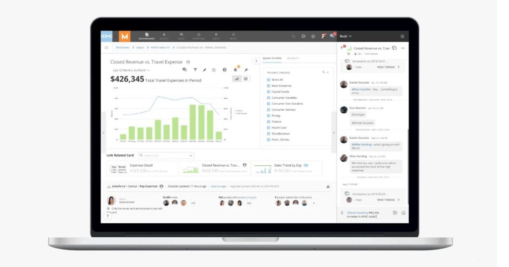
Domo is a cloud-based model that includes a suite of data visualization tools in a single platform, letting you undertake in-depth analyses of your data and share your findings with others through engaging visual representations. Domo’s dashboard allows you to tell a data story with a combination of cards, text, and graphics to help you lead others through the data. Using their pre-built dashboards, you can quickly gain data-driven insights. Built on the cloud it helps you readily integrate with data stored on other clouds like Snowflake or Redshift. Domo offers a free trial so that you can evaluate the platform before committing to it fully.
With Looker, you can easily share data visualizations with anyone, regardless of the tool they use. You can quickly export these documents to any format you like. It also has a customer service department ready to respond to any inquiries you might have. Users can take advantage of embedded analytics, schedule and automate the distribution of reports, specify custom criteria to get alerts and create interactive and dynamic dashboards.
Conclusion
No matter how accurate your data is, if the underlying data doesn’t tell the right story and offer pleasant visuals, then users won’t get value from them. To avoid telling incomplete, misleading, or inaccurate stories, it is imperative to understand the amount and scope of your data, including the type of information you want to share and the types of decisions you want people to make. And data visualization tools are one such tool that can present complex data in an explanatory and exploratory visual that depicts the complete story to your audience, allowing them to connect correlations, identify trends, and come to their own conclusion or form their own opinions.
When it comes to data visualization tools, we’ve barely scratched the surface because there are so many vendors to choose from. Nevertheless, a software platform is only as good as its programmers, and data must always be of the highest quality. Sparity offers data visualization consulting services to companies who wish to create dashboards that revolutionize their data analysis processes.[/vc_column_text][/vc_column][/vc_row]